Friday Fury - User Interface
Update:
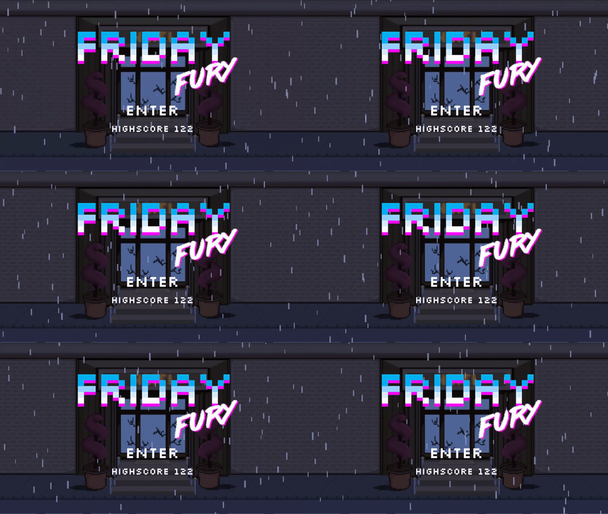
This Devlog will focus on the UI elements of Friday Fury and its overall art style. The aesthetic of Friday Fury is strongly rooted in the synthwave genre, with references to films such as drive with the main character and the game's background soundtrack.
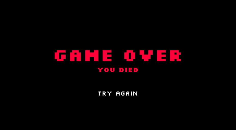
Main Menu & Death Screen:
The background of the main menu in Friday Fury is a custom piece of pixel art that I developed to better capture the vibe and set the initial tone of the game. A particle system was then added to visually simulate rain in the scene, adding to the theme of the game. This was then paired with a background soundtrack that lasts for roughly an hour that was set to not be destroyed and keep playing as the player plays the game. Giving the player a significantly large period of time to finish the game. A rain sound effect was also added to improve the overall feeling of the game.


HealthBar & Scoring:
To stay in line with the style of the game, the health bars for Friday Fury were made to be simple and bold, using contrast to clearly show the player their own health or the enemy's health. This was done through the use of sliders within Unity's UI functionalities, the health bar consists of a slider and a border around it to make the slider fit the aesthetic of the game. A scoring system was also implemented so that the player could track their high score. In terms of the player's user interface, this all was placed on the top left of the player's screen, with the player's health bar above the player's score.


Friday Fury
More posts
- Friday Fury - Documentation & AccreditationOct 15, 2022
- Friday Fury - Game Testing & Future UpdatesOct 12, 2022
- Friday Fury - Boss Room UpdateOct 12, 2022
- Friday Fury - EnemiesSep 24, 2022
- Friday Fury - Basic Level Blocking & GraphicsSep 20, 2022
- Friday Fury - Player MovementSep 12, 2022
- Friday Fury - Game ConceptAug 26, 2022
Leave a comment
Log in with itch.io to leave a comment.